


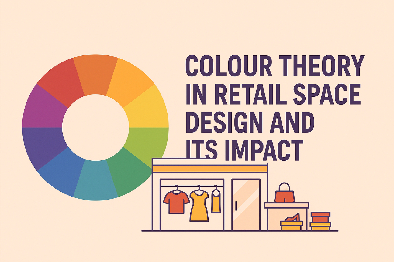
COLOUR THEORY IN RETAIL SPACE DESIGN AND ITS IMPACT
Ever been caught out of the blue while you were painting the town red? Or been green with envy watching the black sheep of the family earn awards you never thought they would?
Colour is part of our lives, our everyday conversations, subconsciously creating and conveying meaning and emotions. So why should it be any different in retail design? A powerful tool to shape perceptions, colour can influence shoppers’ feelings and decisions, drive engagement, and ultimately, boost sales. If done right, that is.
The psychology of colours in retail store design
Used precisely, colour psychology in retail can directly impact buying behaviour. Strategic use of colour helps stores communicate their brand message, influence emotions and guide customers to positive purchase actions.
Here’s a quick breakdown of what common colours evoke:
- Red: Creates a sense of urgency and sparks appetite. Think clearance sales or fast-food chains like KFC.
- Blue: Builds trust and signals professionalism. Ideal for tech or electronics stores like Samsung or Apple.
- Yellow: Grabs attention and suggests optimism. Often used in impulse-buy zones or discount areas.
- Green: Reflects nature and calm. A favourite for eco-conscious brands like Whole Foods.
- Black: Evokes luxury and exclusivity. Staple in high-end fashion stores like Chanel.
- White: Clean and minimal. Works well in modern or premium stores like Muji or Apple.
Each colour carries its own weight and meaning — and using the right one could mean the difference between a customer walking in, or simply walking past.
How colour theory affects the retail store experience
Colour does more than decorate—it directs, persuades, and transforms.
- Influences customer psychology: Warm colours energise, cool ones soothe. Judicious use sets the right emotional tone.
- Enhances brand perception: A well-aligned colour scheme strengthens identity and maintains consistency across brand touchpoints. A minimalist brand using neon pink? Confusing.
- Guides navigation: Smart colour blocking helps customers instinctively move through space. Think red for sale zones, or calming green for chill-out corners.
- Shapes the shopping experience: Colour sets the mood. It can speed people up, slow them down, or entice them to explore more.
Points to consider while choosing colours
· Brand identity
Your palette should echo your brand values. Are you playful, bold, or serene? Let colour say it before your signage does.
· Target audience
Younger crowds may respond to bright, bold hues. Older shoppers might prefer softer, muted tones.
· Cultural context
Red screams “SALE” in the West but means “luck” in China and “mourning” in South Africa. Know your audience, not just your Pantones.
· Lighting and material compatibility
Always test colours under actual store lighting. A chic beige on the swatch might turn sad and grey under fluorescents.
· Contrast and visibility
Ensure key signage pops. That 10% off sign isn’t helpful if no one can read it.
· Emotional and behavioural impact
o Warm colours (reds, oranges, yellows): Create urgency and movement
o Cool colours (blues, greens, purples): Invite calm and lingering
o Neutrals (white, grey, beige): Offer sophistication and balance
While colour is important, it is an easy trap to fall into. Going overboard is a slippery slope – rainbow stores aren’t trendy, unless you are literally selling rainbows.
Colour application in different retail spaces
How do you use colours across varying retail scenarios? Here’s a handy guide.
· Fashion Retail
Trends are everything. Brands use colours to reflect the season — pastels in spring, earthy tones in autumn. Zara often updates palettes to feel fresh and on-trend.
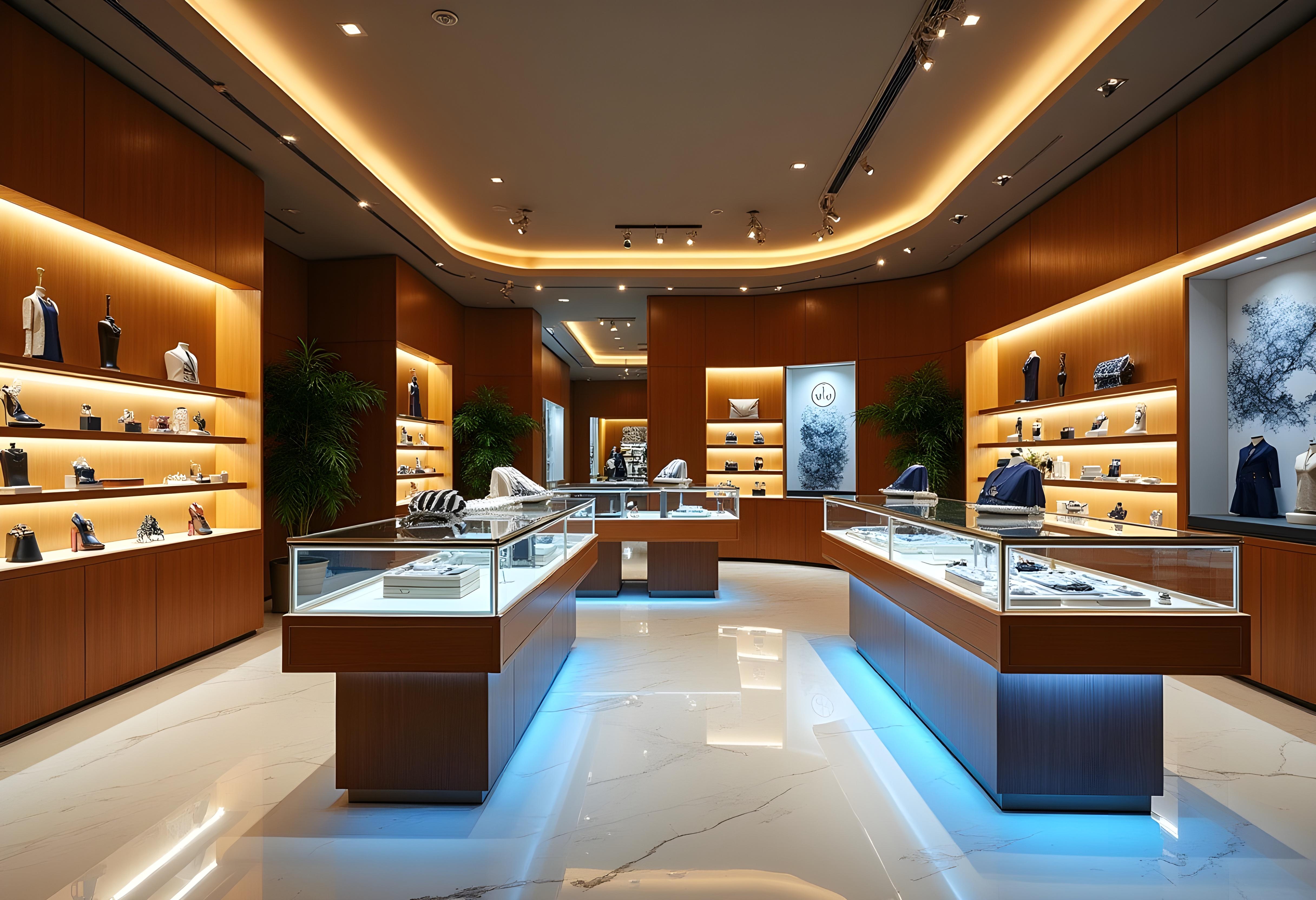
· Luxury Retail
Deep hues like black, navy, and emerald green create a sense of sophistication. Stores like Gucci use lighting and colour to highlight exclusivity, not overwhelm.
· Supermarkets and grocery stores
Colour drives purchase subtly. Red and yellow attract attention and increase appetite — spot them in fast-moving consumer goods aisles.
· Electronics and tech stores
Clean, professional palettes dominate here. Think greys, blues, and whites to reflect innovation and trust — best exemplified by stores like Apple or Microsoft.
· Health & beauty stores
Pastels, light pinks, soft greens, and cream/ivory help evoke calm and self-care. Brands like Aesop or Lush rely on gentle colour cues to create relaxing environments.
Each space has its own strategy; what works in a spa-like beauty store would be a disaster in a bustling discount outlet.
Colour isn’t just an aesthetic choice—it’s a retail strategy. When used wisely, it becomes a silent salesperson, influencing how customers feel, move, and buy.
.jpg)
Share this blog:-